
Our Main Challenge?
At Retail E-commerce Ventures the first task that was delegated to me was to suggest design improvements for Modells.com as an assessment of my abilities. To give you an idea about Modells.com, it is a sporting goods website and one of the developing brands of Retail E-commerce Ventures. My challenge was that as an intern, I wasn't given access to internal analytics of the company, so I had to do my own research to make the necessary design recommendations and give the tech team a good first impression of my work. The time dedicated for this task was 1 month.
My research strategy was mainly quantitative depending on analytics and real life customer reviews from various sources. This was mainly because the website was already active and going through the testing phase.
Throughout my research, I asked the following questions:
- Who are our Customer?
- What are our customers' goals?
- What are the areas we could overcome out competition?
- What are the issues with the website?
What I learned from research?
My research, overall, consisted of two parts. Part 1 was targeted at getting to know our users so I looked at customer demographics, behaviors, customer reviews, and user goals. And part 2 was dedicated to understanding our competition and guiding the website iterations, so I did a competitor analysis and quality assessed the website for issues in functionality and usability.

Knowing our Customers
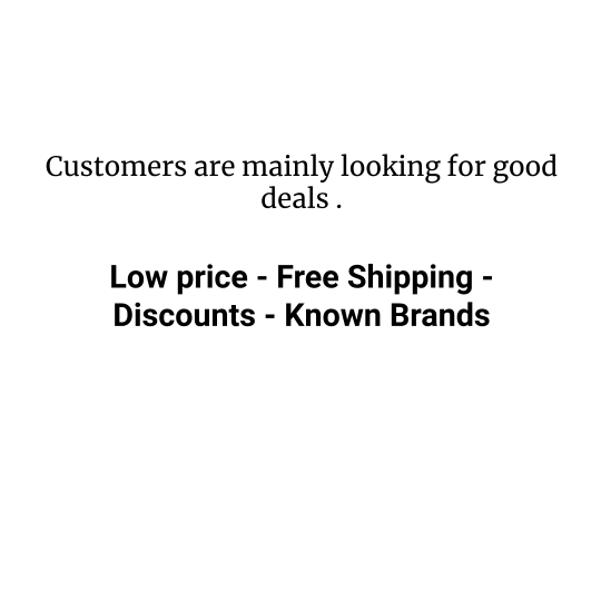
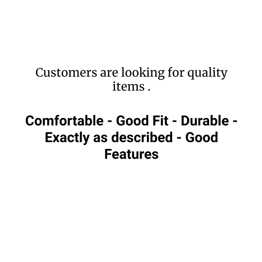
The research showed that our users are financially independent, usually are time-constraint, brand loyal, and they buy to satisfy their needs above all else. This tells us that these users are willing to spend on items that spark their interest, will not tolerate delays in their shopping experience, and expect to be rewarded for their loyalty. And the main user goals where as follows:
 |  |

Outshining Our Competitors
| I continued by checking out the different customer reviews on various websites such as Trustpilot.com, Knoji.com, and similarweb.com and I did an analysis of our brand vs its main competitor. This helped me highlight the strengths and weaknesses of our website and pinpoint possible areas of improvement. I created a customer empathy curve to highlight areas where we can surpass the competition and moved on to quality assessing the website. Some of the main issues I found were the use of confusing terms and the complexity of the navigation bar, having no guaranties regarding the quality/comfort of the items, the lack of a forthcoming shipment tracking, and the absence of proper communication of the return and cancellation policies. | 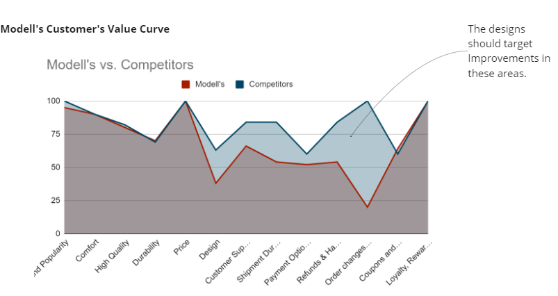 |

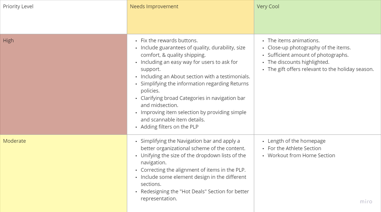
Summary of Pain Points vs. Helpful Features
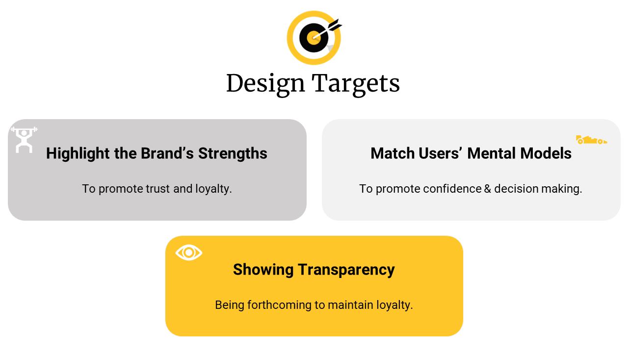
Design Targets:
After analyzing the data it became clear that our aim should be to provide our customers with a simple shopping experience where they could easily learn about item specs such as comfort, size, and durability and make purchases at convenient prices. Our website should reassure and guarantee the users quality in both products and services to promote confidence, loyalty, and trust.
Design Recommendations
| To highlight the Brand's Strengths | To Match our Users' Mental Models | To Show Transparency |
On frequently visited pages, we need to draw more attention to:
| We need to specify within the Product Detail Page of each item the keywords and the specs that the users are looking for such as:
And make these extra prominent and simplistic without being cluttered with extra info. | We need to make sure that the users are informed of any need-to-know information before their purchases. Such as:
|
I communicated these to: Other members of the UX team to handle the designs guided by my suggestions. I discussed functionality issues with the developers. | I communicated these to: The Pull Marketing Team and the design team, as well, showing them examples of what went wrong. | I communicated these to: The UX design team and the Tech Ops team. It was brought to the attention of the Customer Services team as well. |
Impact:
I summarized these main issues in a customer journey map to communicate the results in a concise manner and to create more empathy among the stakeholders. And I presented it along with the customer value curve first to my mentor and then to tech team over several meetings. They all appreciated the work I have done and the team lead updated the backlog with my recommendations. My efforts allowed me to make an excellent first impression, and I was immediately given the opportunity to handle a more complex assignment, which is working on the redesigns of one of the main brand websites.
Lessons Learned?
- I learned that my communication should be short to the point with minimal technical terms since nobody cares about the process but about the outcome.
- I learned that face-to-face meetings are more effective than any other type of communication.
- I learned how to keep a balance between being pushy and lenient with other team members to get my work done.
| What worked well? | What I would do differently? |
|
|


