My Main Challenge?
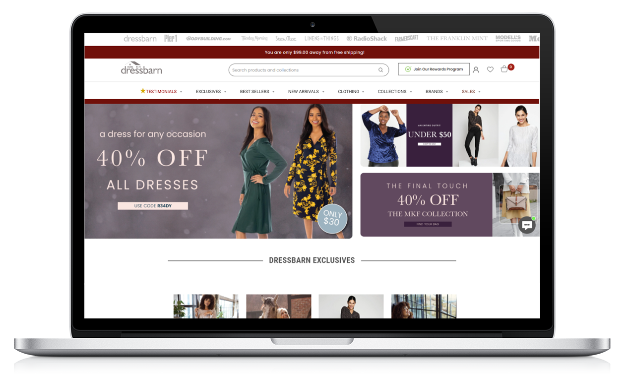
I was assigned the task of understanding and conveying why is Dressbarn.com losing popularity and suggest modifications before the holiday season. To give you an idea about Dressbarn.com, it is the 3rd best performing brand of Retail E-commerce Ventures after Pier1.com and bodybuilding.com, and it was expected to bring considerable revenue during the holiday season. This task turned out to be a huge one since I realized that the Tech team was not familiar with our users (which means empathy towards the users was low). Plus, I found several usability and functionality issues that needed immediate attention.
My challenge was that as an intern, I wasn't given access to internal analytics of the company, so I did my own research to make the necessary design decisions. The time assigned for this task was the month of November, which meant that the entire task had to be done ASAP. My research strategy was mainly quantitative depending on analytics and real life customer reviews from various sources. This was mainly because the website was already active and any applied assumptions will directly be tested by real life users.
I started my quest by asking the following questions:
- How are our Users feeling about the brand?
- What are the usability & functionality issues on our website?
- Who are our customers?
- What are the design targets of the highest priority?
What I learned from Research?
Overall, throughout my research I looked at customer reviews and quality assessed the website for issues in functionality and usability. This helped me pinpoint 3 categories of issues:
- High-priority (Not tolerated by the users)
- Medium-priority (causing some irritation but still tolerable)
- Low-priority (Minor issues that need addressing on the long run)
I also checked customer demographics & behaviors to come up with designed solutions tailored to their needs. And every step of the way I was documenting my findings and communicating them to me mentor who provided me with feedback.
 What were the high priority issues?
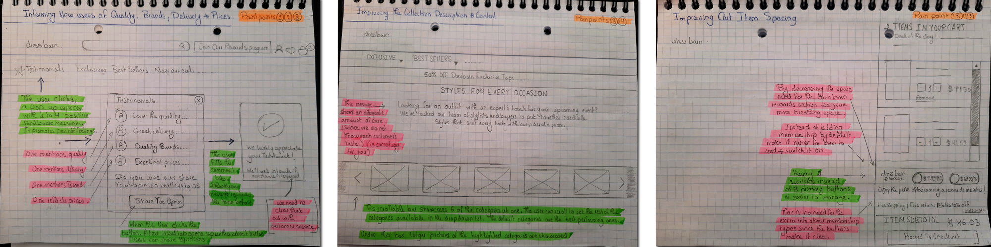
The three major issues that needed tending to where mainly related to the cancellation policy, the return/refund policy, and the loyalty program which were not forthcoming and this caused the user to lose trust as they felt being cheated. I created a customer journey map dedicated to to highlight these issues and several others. I categorized the issues by priority and by type (Functionality/Design) and communicated the results to my manager, who was impressed by my research and asked me to work on design suggestions.
| This review is from Trustpilot.com | This review is from Trustpilot.com |
 |  |
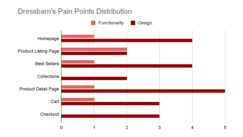
| This review is from Trustpilot.com | A summary of the Quality Assessment Results I did |
 |  |
Creating Unity:
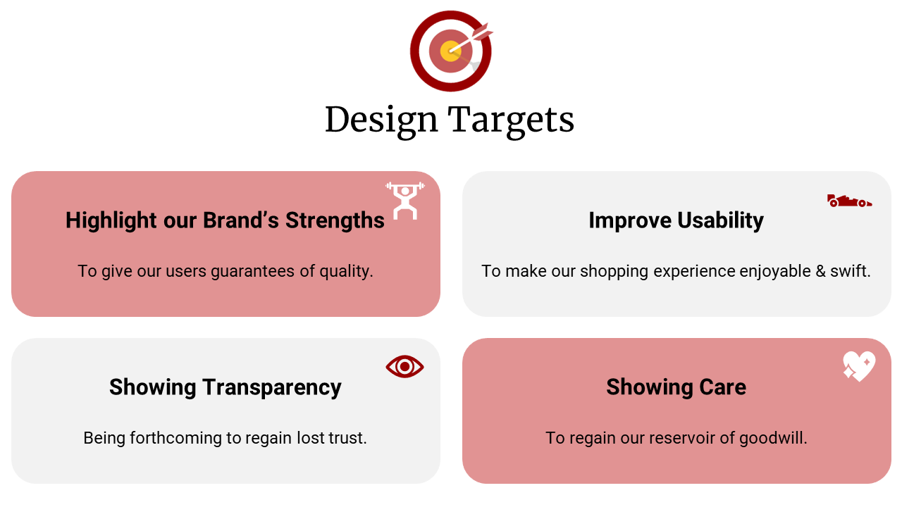
To come up with the design targets, I needed more insights about our customers and their expectations. So, I looked at customer demographics and behaviors. My findings made me realize the importance of making the shopping experience enjoyable, visually appealing, and extremely simple since the majority of our users were busy mothers who tend to have shopping outbursts and many of them shop for leisure. These findings also opened my eyes to the importance of being forthcoming throughout the process and highlighting the satisfaction of other users to promote confidence, since 85% of our customers said that if they liked a brand they would stay loyal to it.
And since I realized early on in the process that the tech team was unfamiliar with our target audience and their mental models, I took a narrative design approach to introduce the team to the user journey, and I complemented the below targets with customer personas and story mapping. My mentor was impressed by the entire approach, the team was engaged and on the same page, and I was asked to move on to the design step.
Design the Solutions
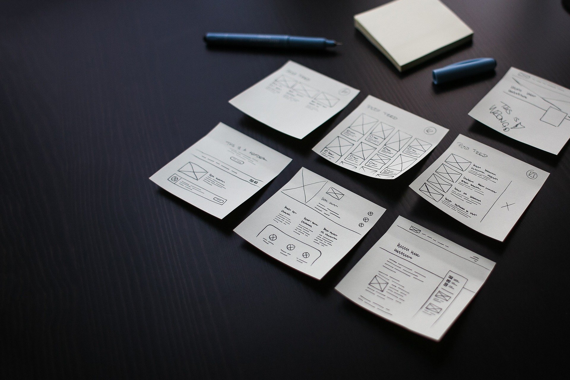
Sketching
With this being my first design task at REV, I was determined to get feedback as early as possible in the process. So, I started by ideation and sketching. Each sketch took several iterations and I was keeping my manager up to date on my progress with constant back-and-forth communication. I was also keeping the entire team informed through my standups during the daily scrum meetings.

Wireframing & Prototyping
I first delivered the solutions of the high-priority problems which needed tending to right away. I created high-fidelity prototypes of the solutions to give the team and management a clear image of how they would look like after implementation. And I scheduled one-on-one meetings with the Quality Assessment engineer, the Lead UX designer, and Lead Software engineer to get feedback.
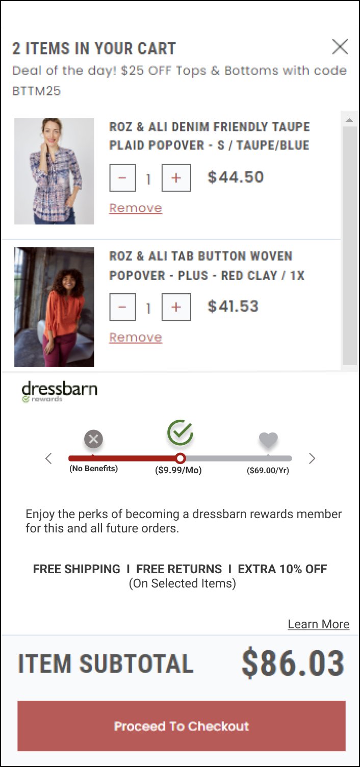
Solution 1: Improving the Cart Overlay functionality and design
Old Design Suggested Design
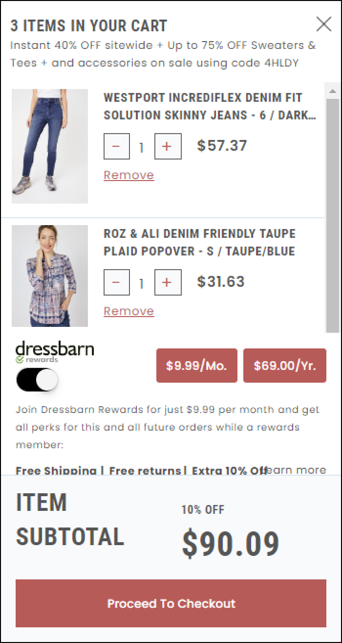
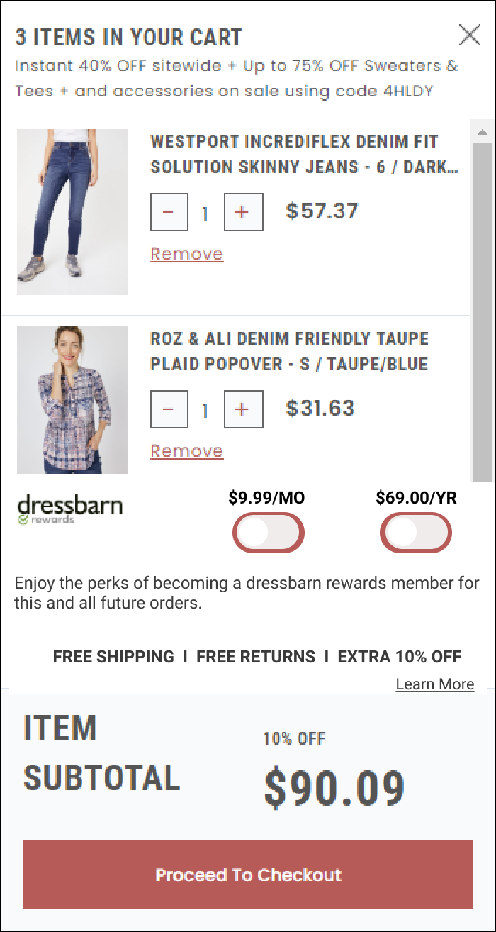
- It provides simplicity regarding functionality
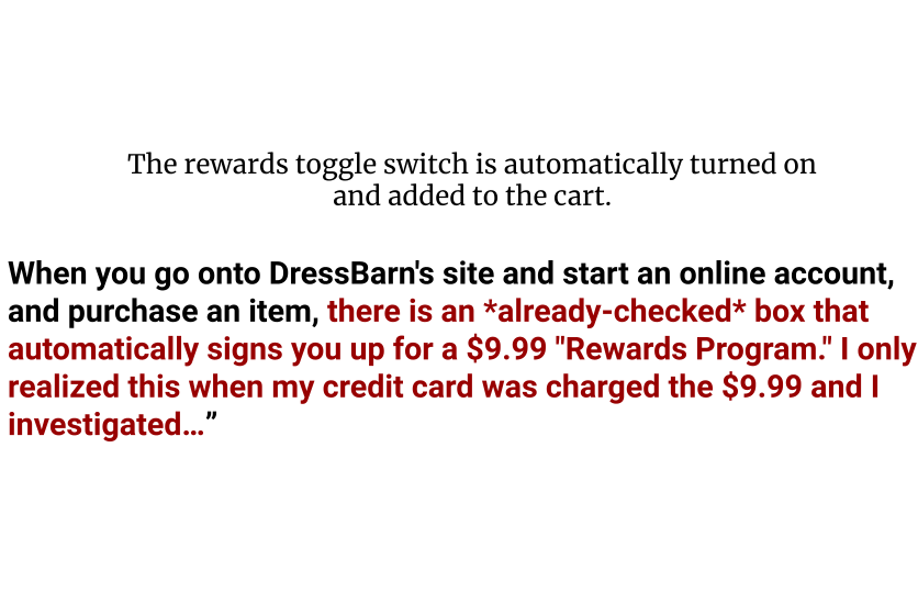
- "Rewards" is not automatically added to the cart.
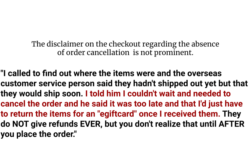
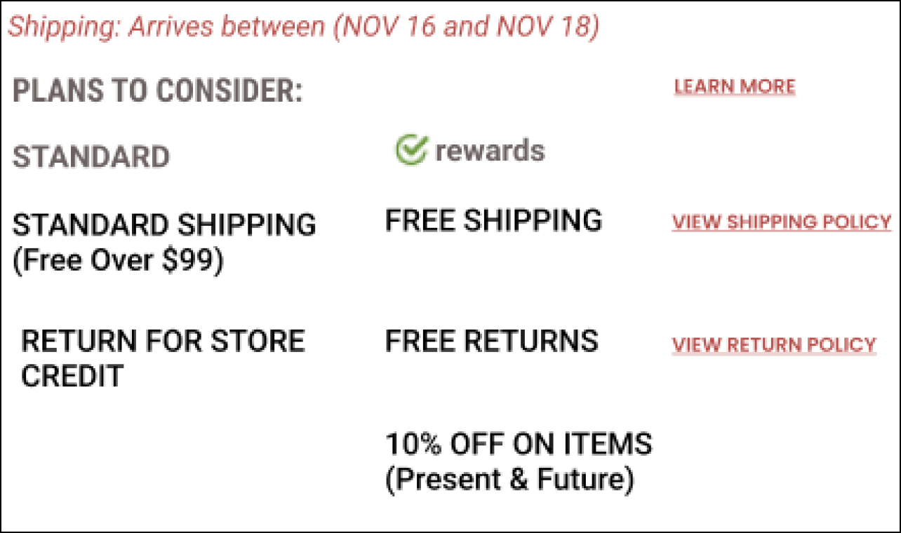
Solution 2: Improving Disclaimer on the Payment Page
| Old Design | Suggested Design | |
| |
|
Old Design | 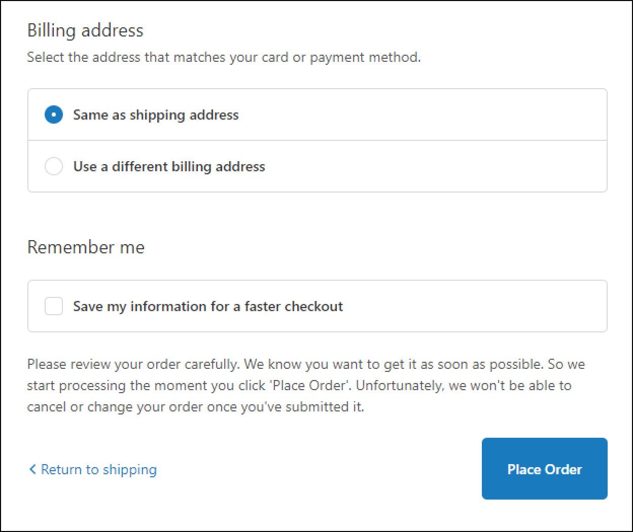 | |
Suggested Design | 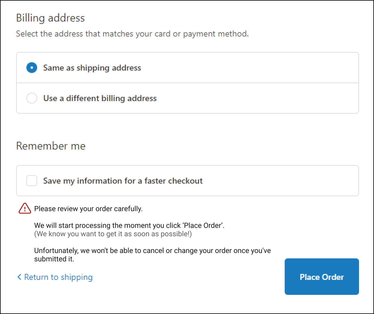 |
|

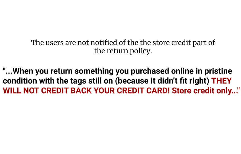
Solution 3: Notifying the Users of the Return Policy
Old Design | 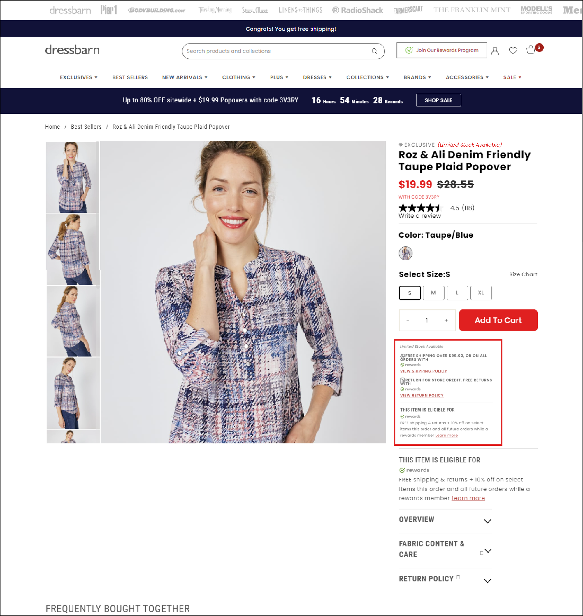 | 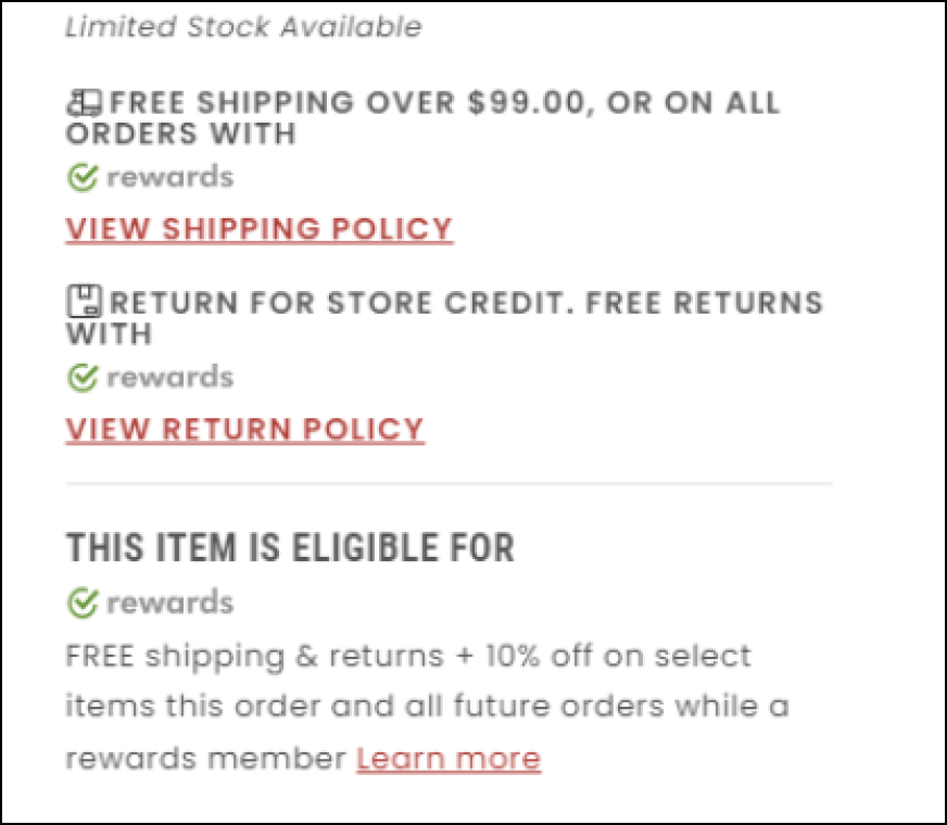 | |
Suggested Design | 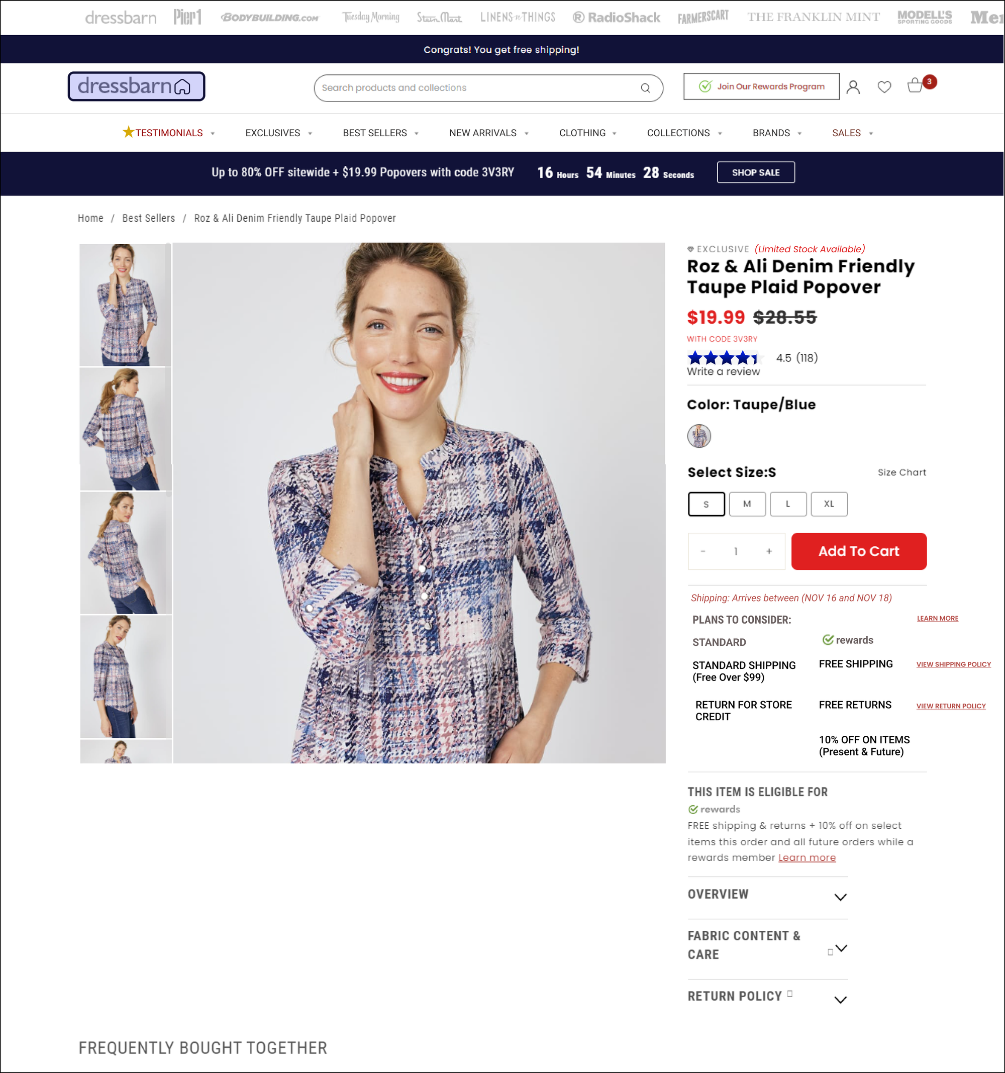 |
|
What were the Iterations?
Everyone liked the designs and the solutions I suggested. Yet, there was a need for some improvements as expected in the iterative UX process. Through the feedback I received and through additional research, I realized the following:
- Overtime with several people having worked on our platform, more than one design library were created and used, which lead to inconsistent designs across the pages.
- The senior UX designers were looking for a more out-of-the-box solution than the toggle switches on the cart to improve the "Rewards Membership" functionality.
- The usability of the discount codes should be at a sweet spot that makes its application easy enough but not too much that it lead the business to losing money.

Improving Consistency
I recreated the Design Library Guidelines including Typography and the Color Palette. I improved on the earlier designs and designed additional solutions for some of the medium-priority problems, as well.
Dressbarn Style Guide
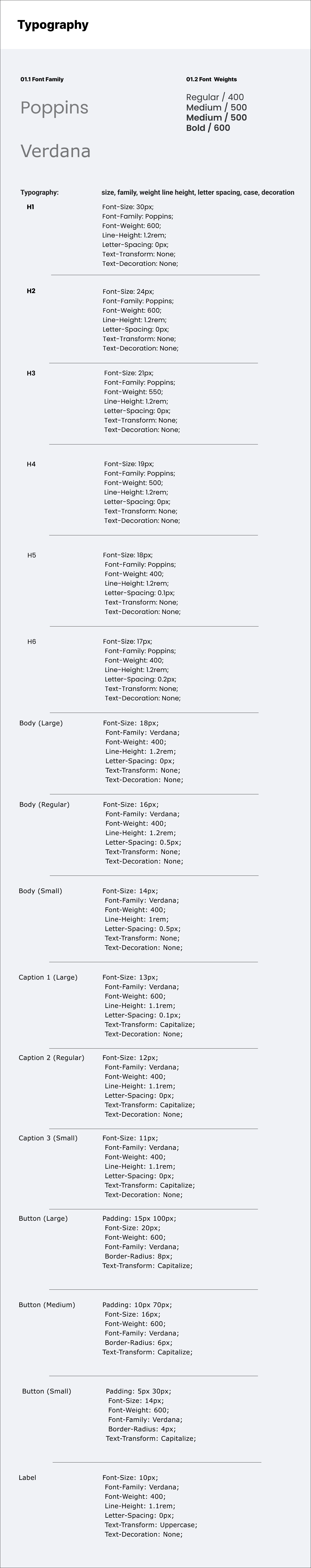 | 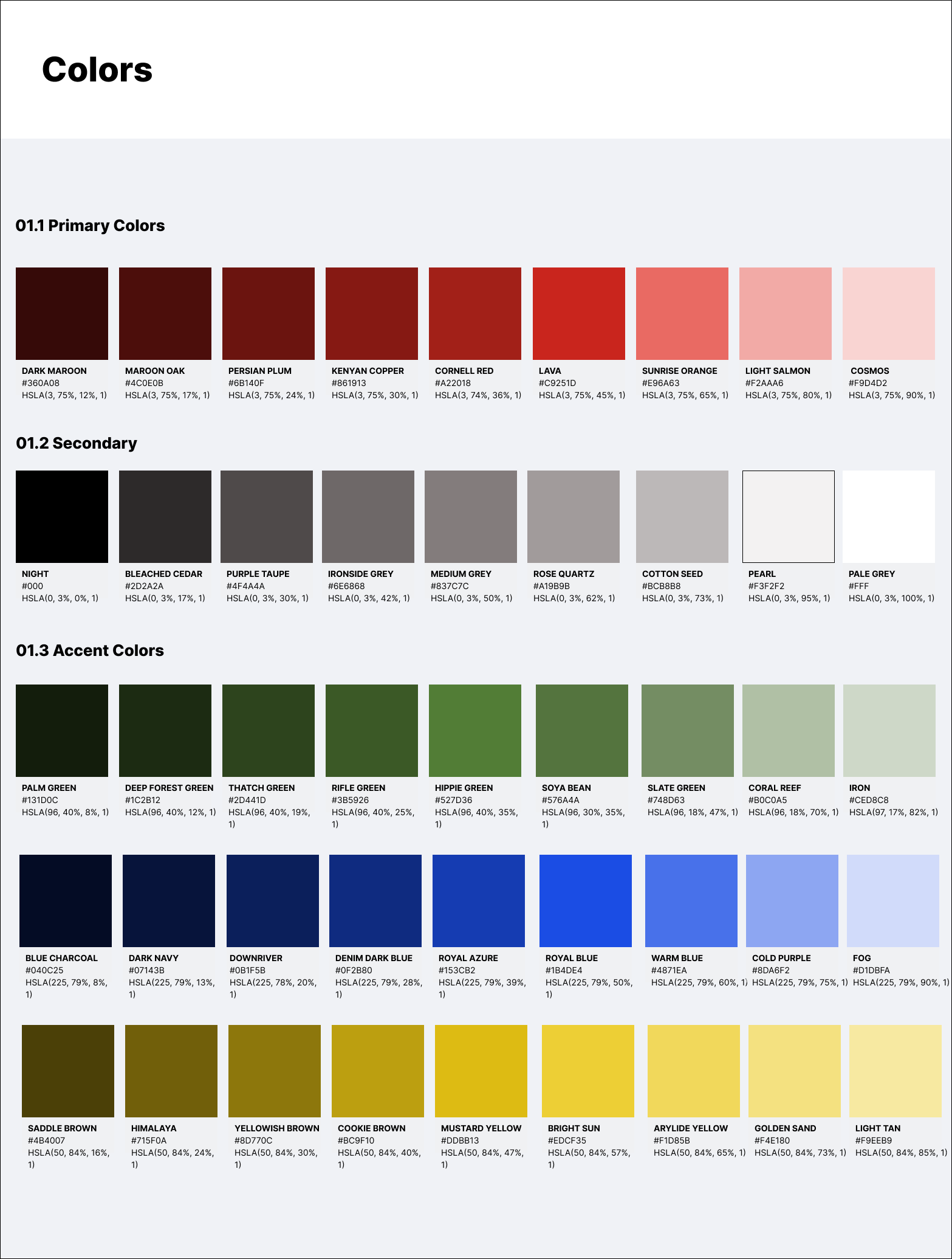 |

The Most Important Redesigns
Iteration 2: The Cart Overlay functionality and design
 |
|

Iteration 2: The PDP Redesign
 |
|
Link for the Full Figma Prototype: Dressbarn_Petra Al Aridi_Full Figma Prototype
Impact
The team loved the redesigns and my Design Library Guidelines where officially adopted. I was also handed the task of uploading the design suggestion and images of the solutions to Jira for the development team. Furthermore, I proposed the idea of simplifying the discount codes by making them a combination of letters and numbers relevant to the promotion they are a part of, and this solution was implemented on more than one REV brand.
I was the only intern in the design team to handle the process of a complete website redesign and who had several suggestions/solutions implemented.
What I learned?
| What went well? | What I would do differently? |
The success of the solutions I provided came from 3 factors:
I noticed that the Tech team reacted to the prototype better when I presented it in a short video form. I experienced how uncluttering the interface affects the UX flow first hand. |
|


