My Main Challenge?
As a student at the UX Design institute pursuing a Professional Diploma in UX Design, my chosen project was to build a flight booking web application for desktops that could withstand the highly competitive market and the variety of solutions already available. I initially planned to finish this diploma over the course of 6 months, yet this timeline changed once I was able to land an internship in the field and time became scarce. My reason behind seeking internships while going through my diploma work was to get field experience and to enrich my portfolio with real life case studies and not just speculative ones.
To give you an overview, this case study is speculative, it covers the entire UX design process, and my research methodology was triangulation. The main reason behind choosing triangulation was to find patterns of behaviors adopted by the users and their mental models from multiple sources of research that could help me validate any and all assumptions made regarding the overall design.
How did the Journey Begin?
It began by asking the right questions. Of course :) !
The Questions I asked were:
Q1: Who are our Competitors? What conventions are they following?
Q2: What are our users' regular behaviors & mental models while using flight booking web apps?
Q3: How user-friendly are the competitor websites? What do our users think & feel while using them?
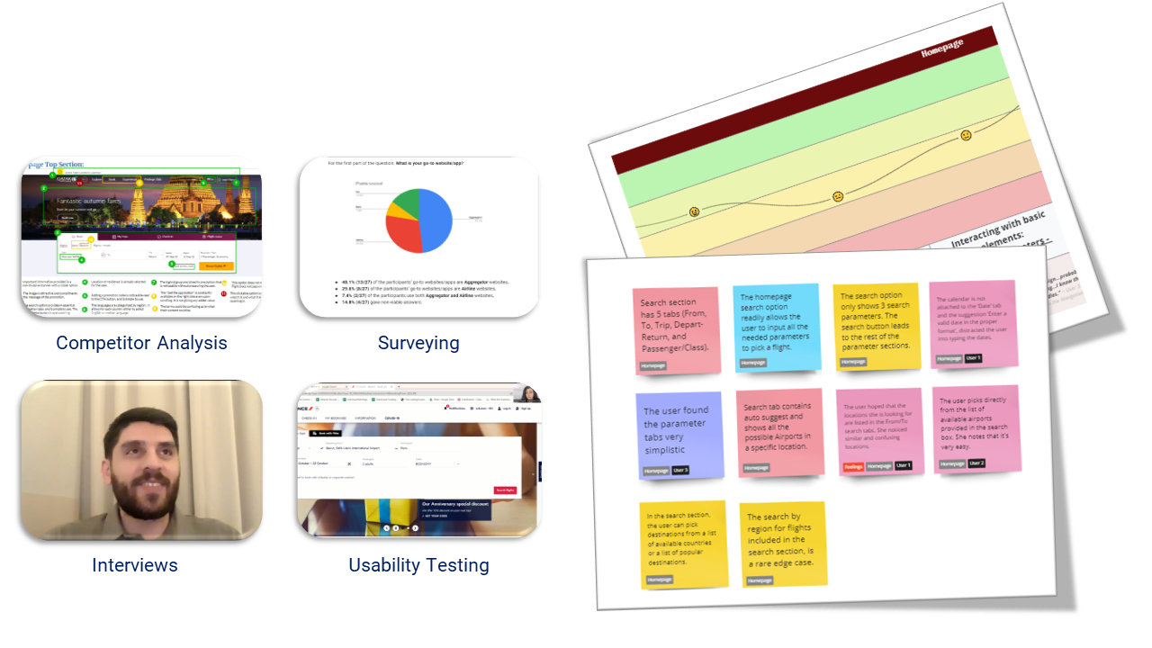
To answer these questions, it was imperative that I get to know my users, my competitors, and the available (on-the-market) solutions and their applied conventions through:
- Competitive Benchmarking
- Surveying
- Interviewing
- Usability Testing
Along the way I was documenting the entire process via reports to communicate my work with the UX Design Institute team and allow them to track my progress.

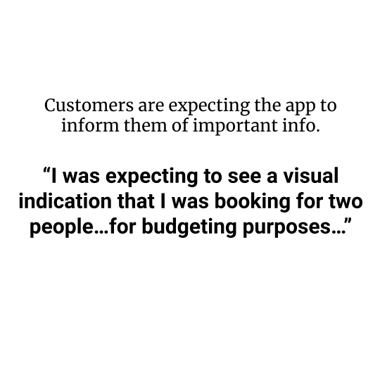
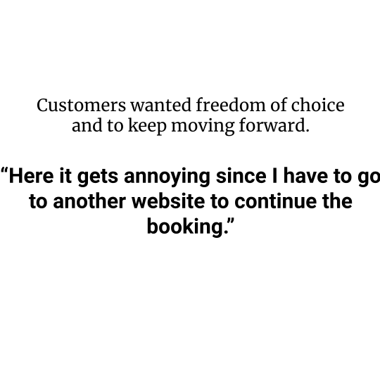
Discoveries
 | The Primary user goal is Booking Flights. |
 |  |
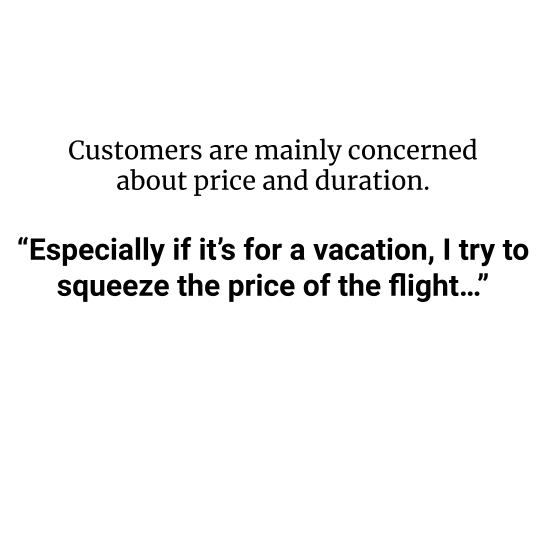 | 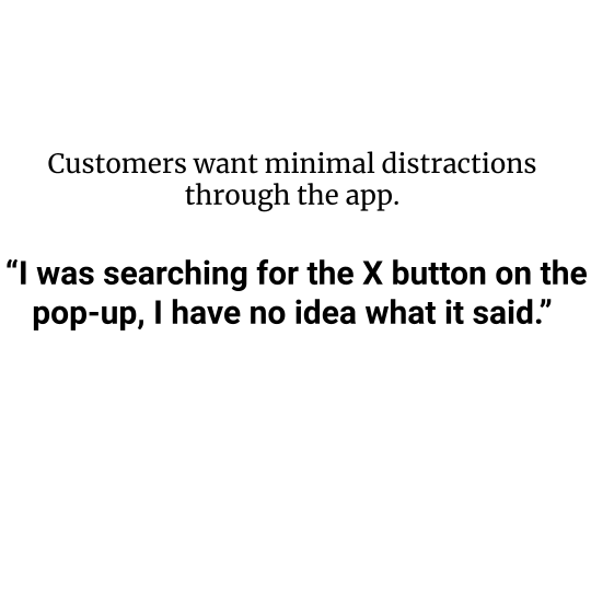 |

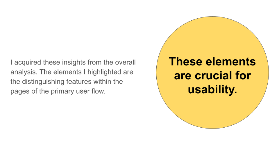
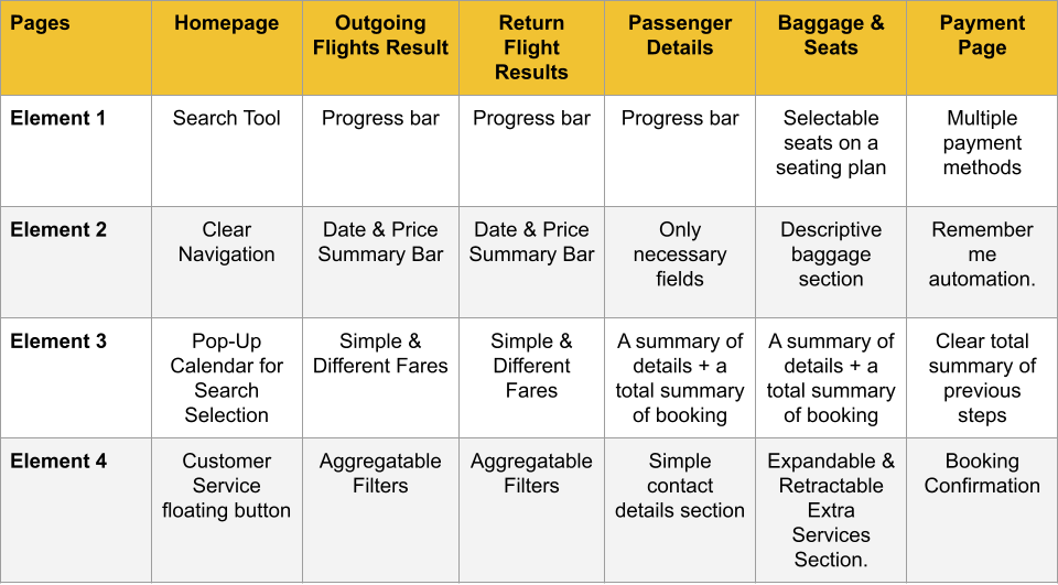
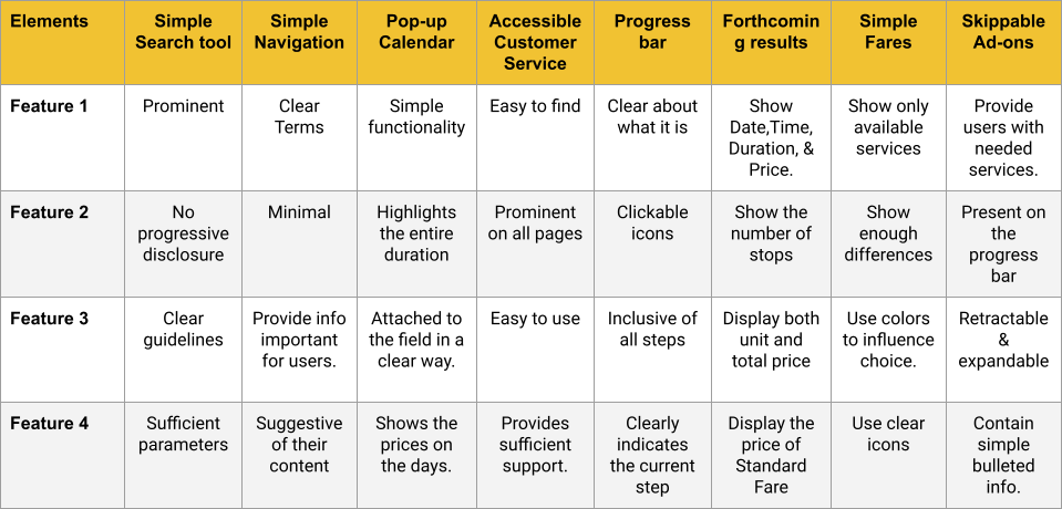
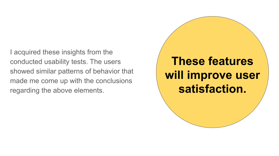
Insights
 |  |
 |  |
How I brought the pieces of the solution together?Through research and analysis, I was able to capture all the problems and pain points that might downgrade the app's usability, and I reformulated them and grouped them into opportunity areas. These were some of the key components of my Customer Journey Map. My next step was to ideate and conceptualize solutions through building the primary user flow and sketching its screens. |


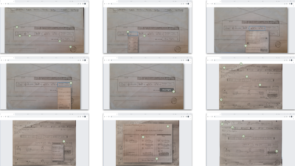
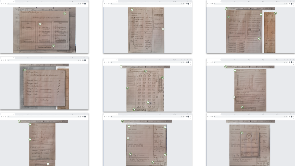
Sketching (Interaction Design)
In each of my sketches, I considered several pain points that the users were facing, and I modified and recreated elements to solve these user problems. Each sketch took several iterations to reach the intended degree of clarity and simplicity.
Final steps of the Journey
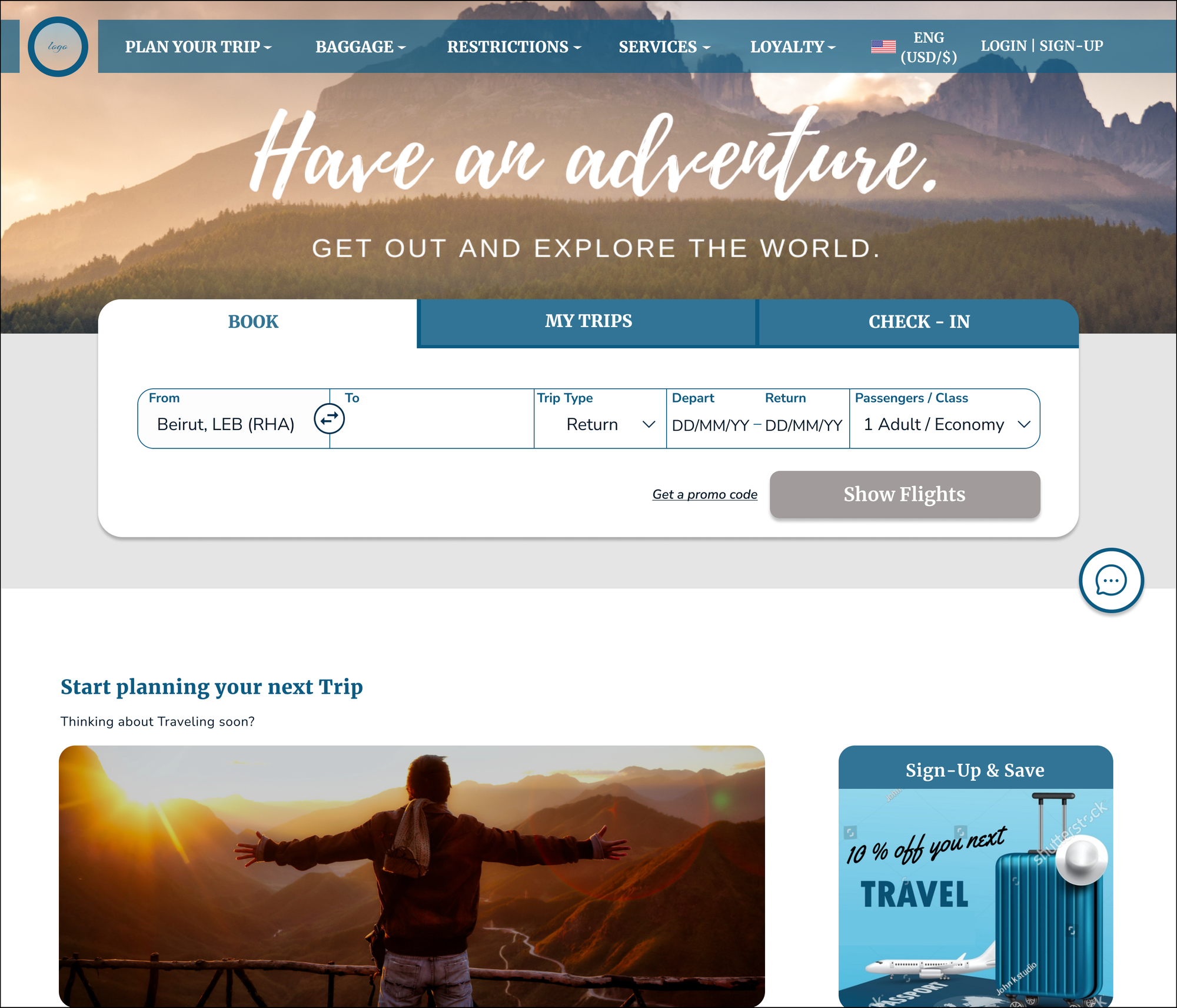
I decided to create a high-fidelity prototype to not only test the validity of the solutions I sketched, but also to explore the impact of visual hierarchy & aesthetic design. Hence, for the sake of consistency, I had to create a design library including typography, colors, shadows, and components. And just like my sketches, each of my designed screens contained several solutions targeted at solving specific user problems.

Main Solutions
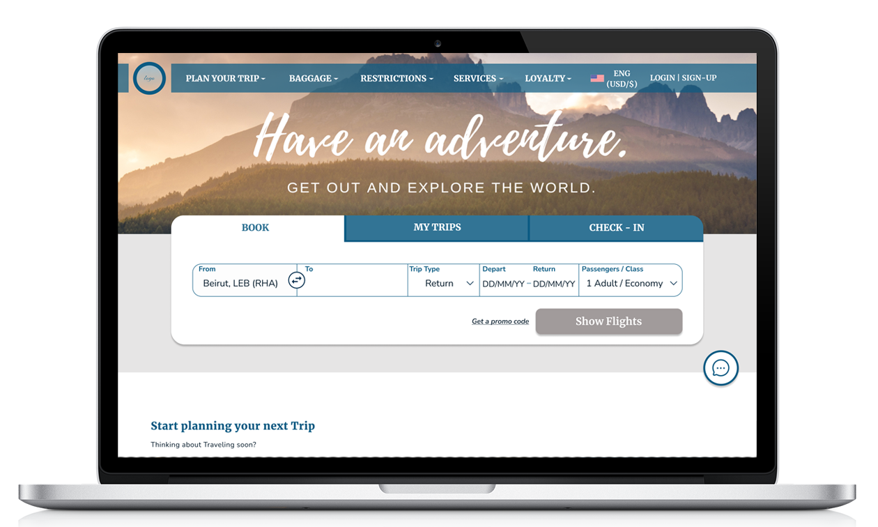
Solution 1: Homepage Design
 |
|
Solution 2: Pop-up Calendar Design
| 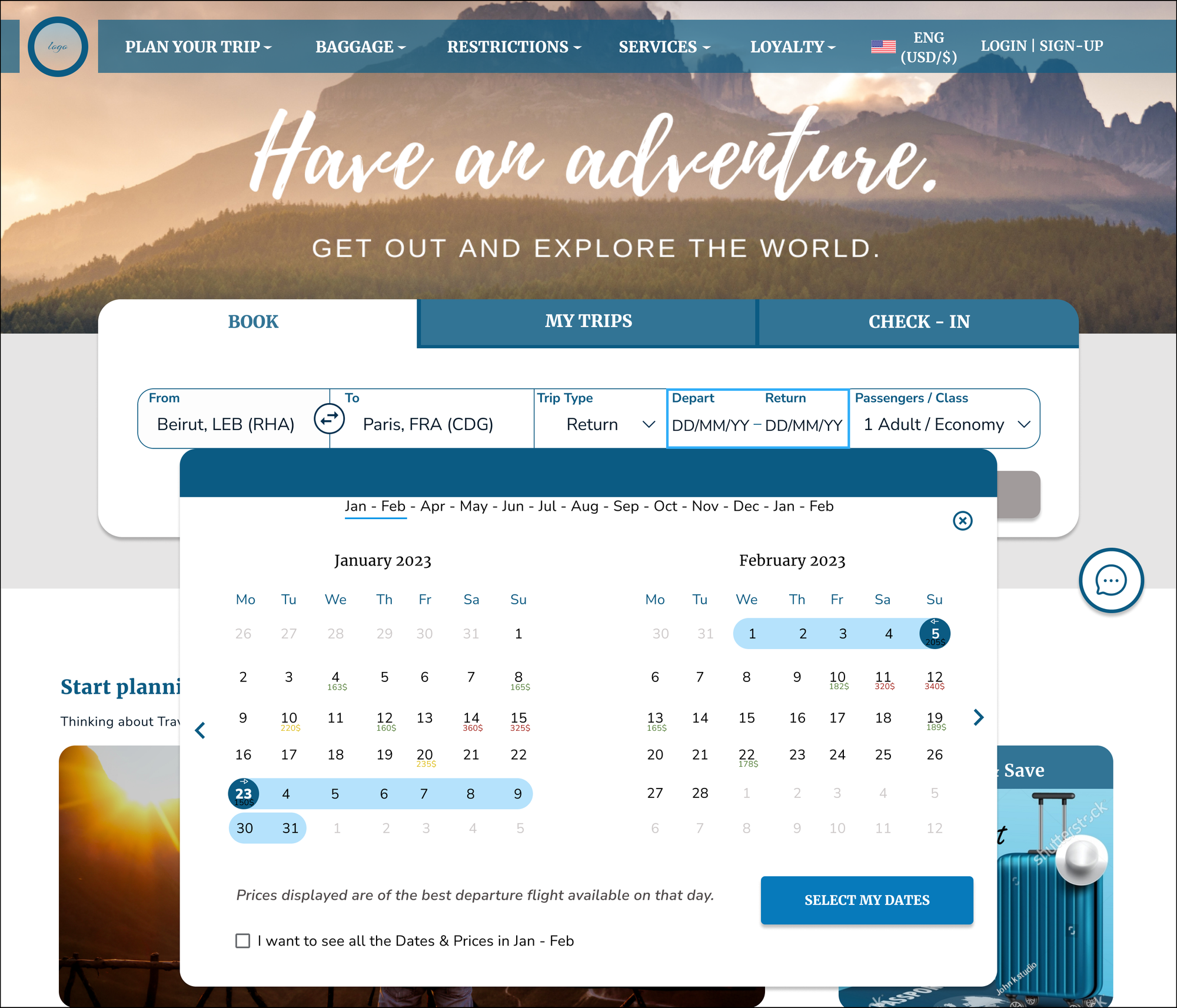 |

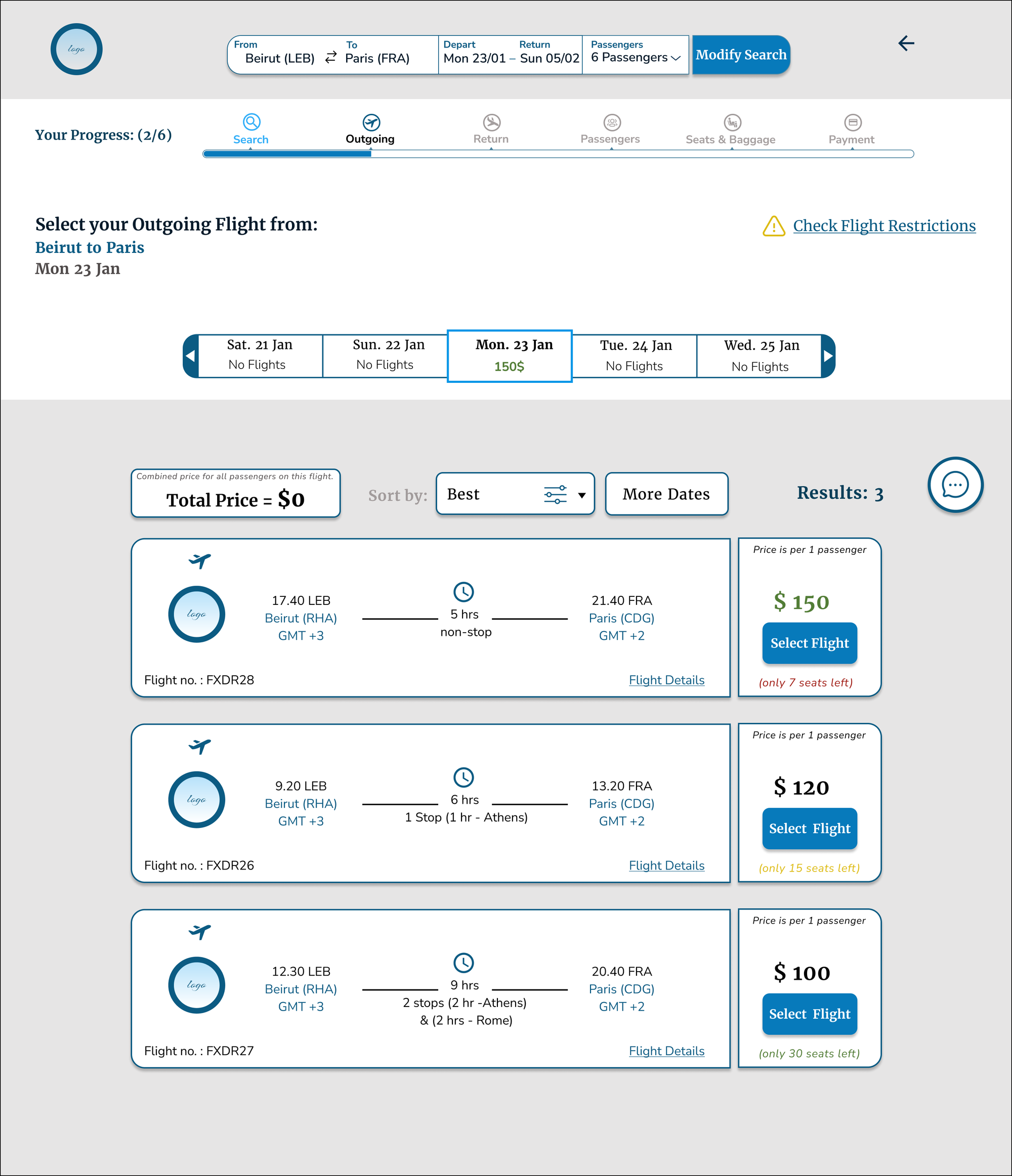
Solution 3: Search Results Page Design
|

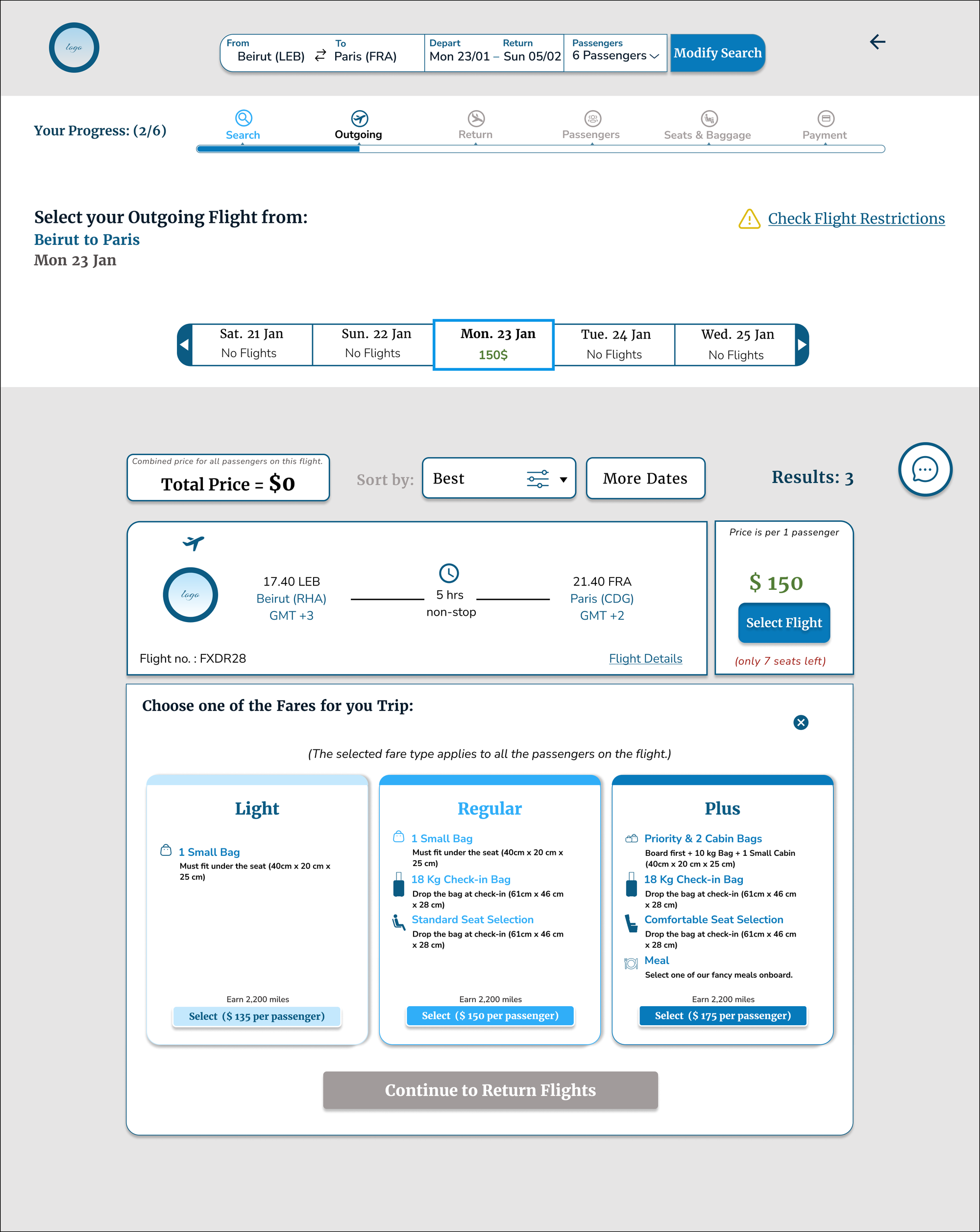
Solution 4: The Fares Section Design
|

Solution 5: Adding Extra Baggage Page
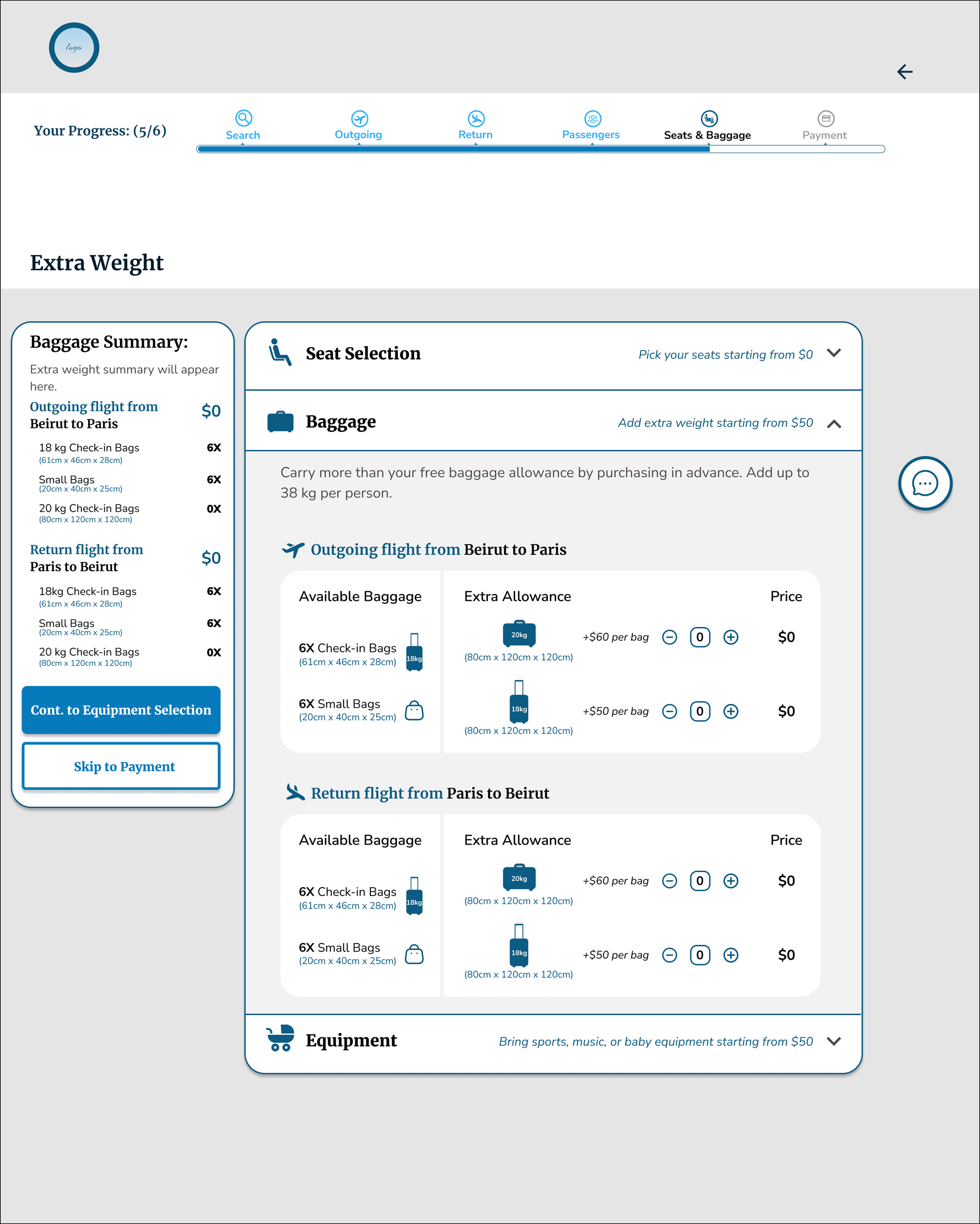 |
|
I finished of my journey by creating annotations and development guideline documentation, where I included both front-end design guidelines and functionality rules.
The full prototype: Petra Al Aridi_Full Prototype
Next Steps?
The next step will definitely be to validate the efficiency and the effectiveness of the design solutions by conducting usability testing of the High-Fidelity Prototype. This will be followed by one or more iterations before development.
Lessons Learned?
This 6 months journey has changed my entire essence and altered how I perceive the world! I applied the UX Design process in its entirety and this taught me a lot:
| What I learned ? | What I would do differently? |
|
|


